How UX design helped
India's leading budget airline
take off.
CLIENT
REGION
DELIVERABLE
TIMELINE
BRIEF
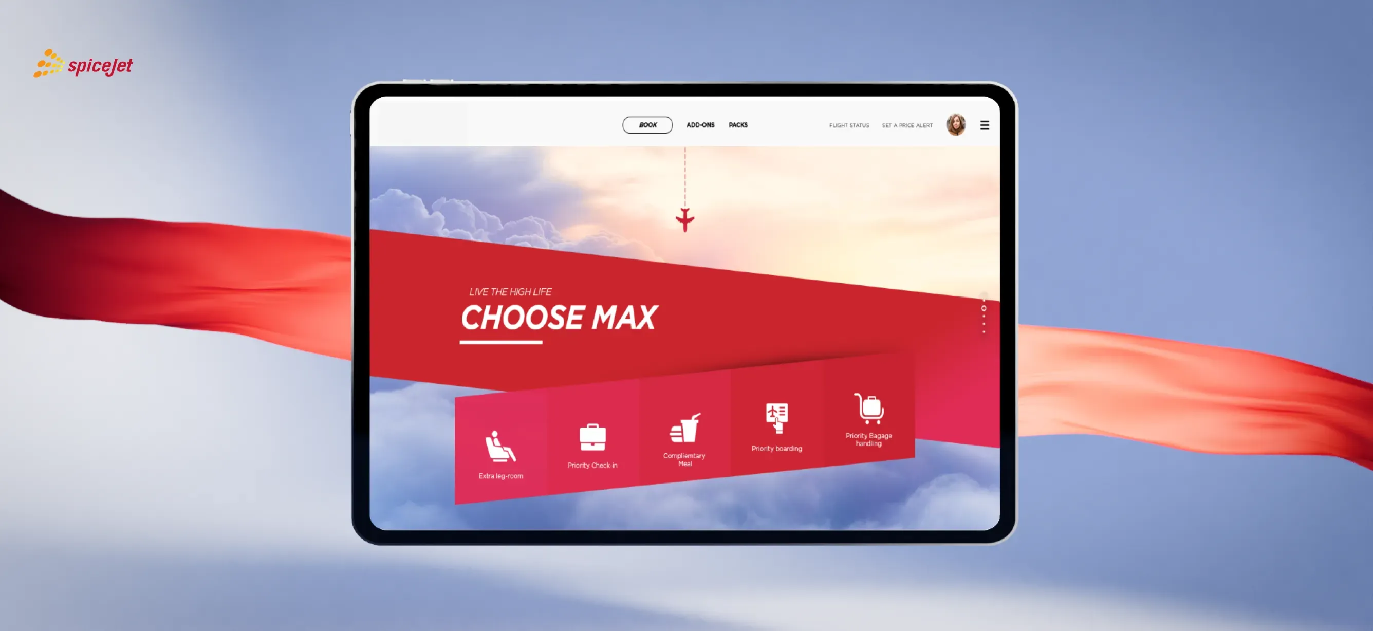
Revamp the ticketing
interface to improve
design, navigation and
seal a booking in 5 mins.
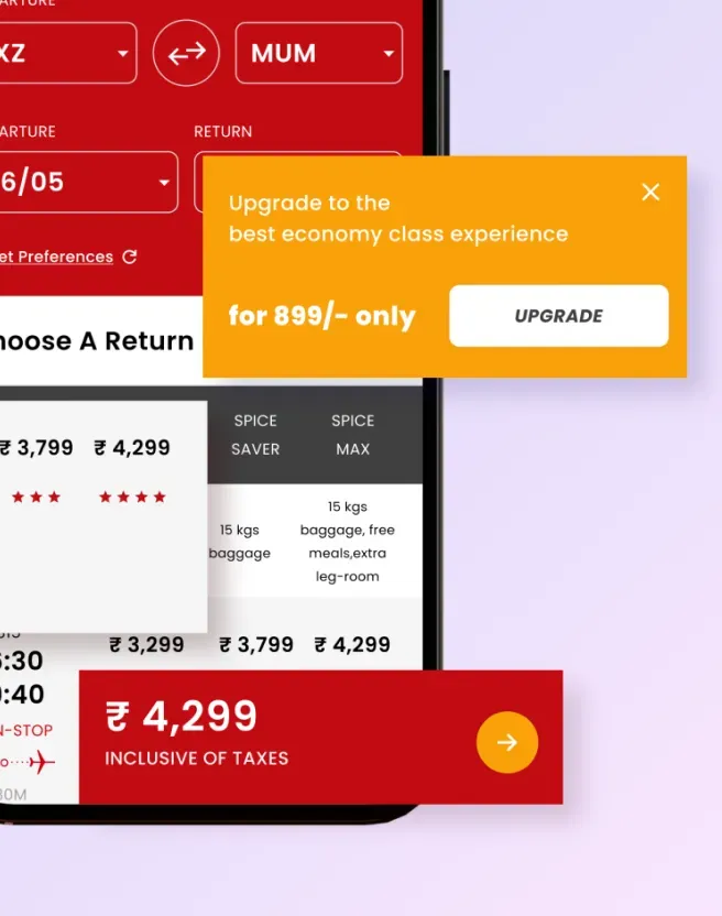
SpiceJet, a leading budget airline, struggled with low website ticketing conversions due to an outdated, unintuitive interface with poor affordance and cumbersome click-throughs. The decline in direct website sales highlighted an urgent need to revamp the core ticket booking experience. The key challenges included a legacy back-end system that couldn’t be immediately replaced and a complex ticketing process with multiple upsell options. Users often got stuck during the selection process, delaying or abandoning purchases. Adding to the pressure, the project had to be completed within a tight 20-week timeline.
OUR ROLE

Immersive UX audits
Analysed the booking interface to diagnose issues like poor hierarchy, unclear call-to- action buttons and complex navigation.

Improve affordance
Enhance visual cues and interactive elements to make the booking journey intuitive and user-friendly.

Optimise click-through paths
Redesign click-through paths to simplify the booking process and reduce user frustration.
Our Approach
Analyze interface flaws through exhaustive user research for a design overhaul.
A thorough evaluation of the ticket booking interface to identify design flaws and user pain points.
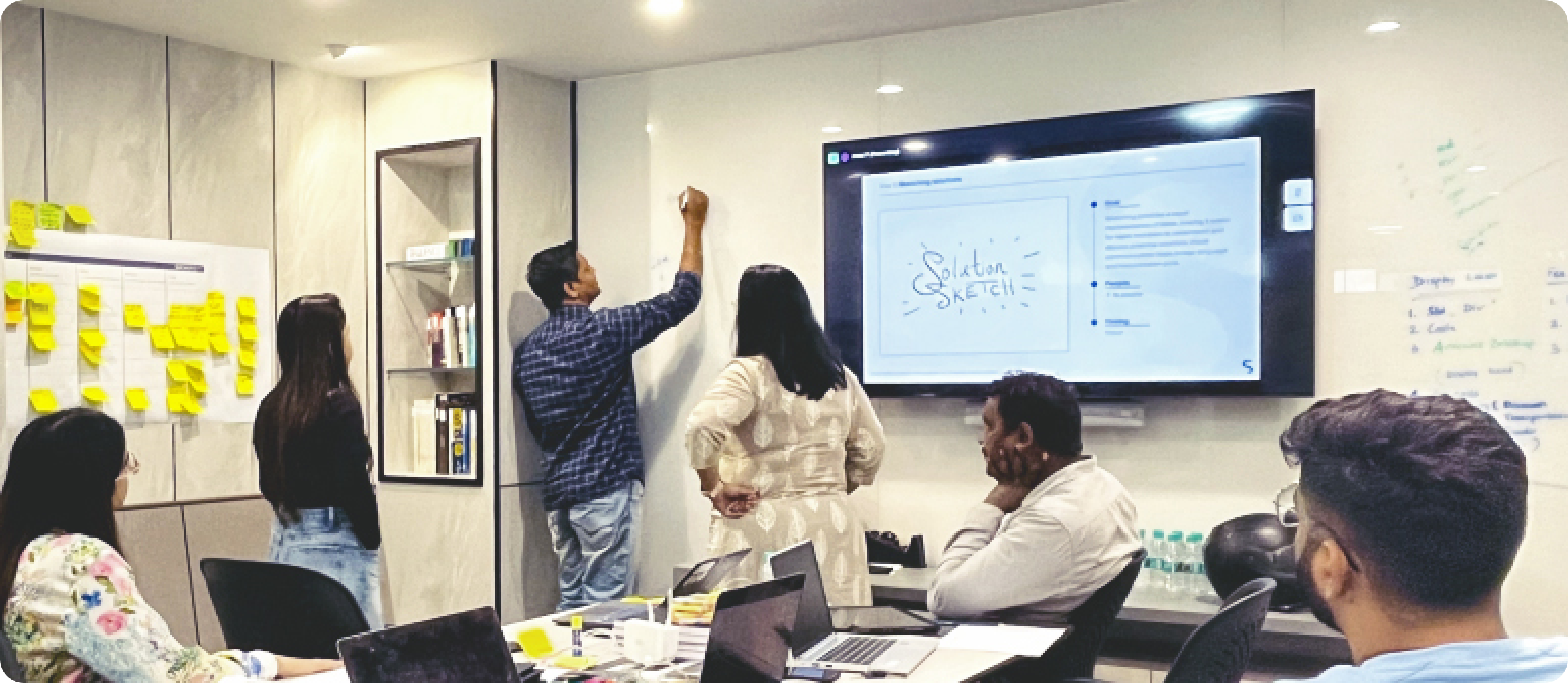
Conducted targeted user research, including interviews and usability testing, to understand booking challenges.
A strategic redesign plan to simplify navigation, enhance affordance, and streamline click-through paths.
Created wireframes and interactive prototypes that address usability concerns and ensure a seamless user experience.
Conducted iterative usability testing with real users to validate and refine the redesigned interface.
RESEARCH
Immersion and UX research.
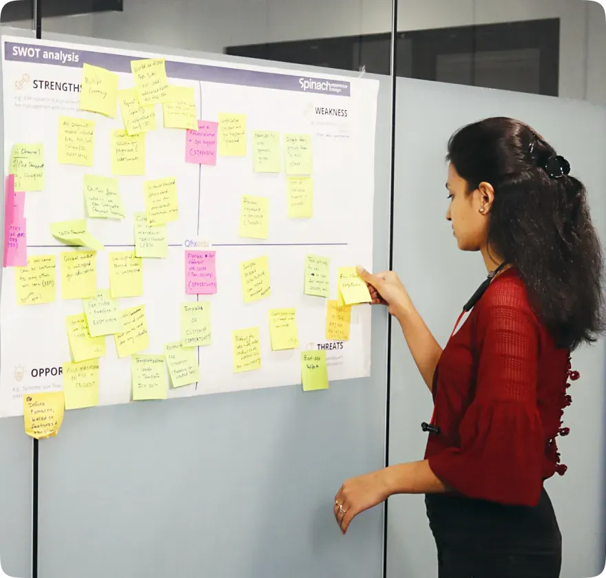
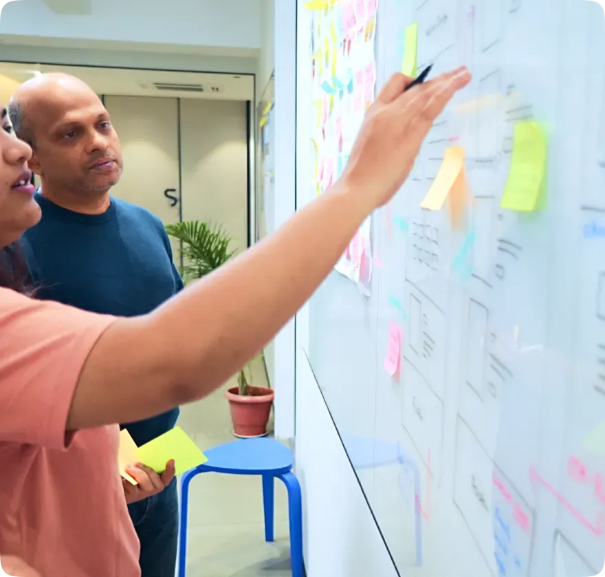
We used a combination of ethnographic and UX methodologies to isolate core issues and prioritise them per user impact and business conversion. Our UX research tool kit included user interviews, heuristic audits, eye-tracking and observational studies. To drive the MVP we finalised a primary user journey and key secondary micro journeys that would immediately address pain points in the main user flow. Our findings: Heuristic evaluation revealed that not only was the booking experience too lengthy but the simple act of finding a call-to-action was also tedious. Thus, booking a ticket via the website was both frustrating and detrimental for business.

IDEATION
Legacy solution challenge.
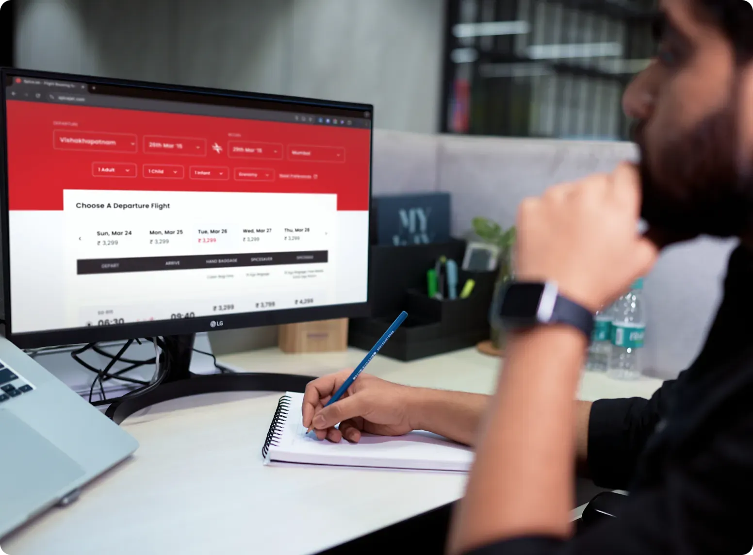
The base code for an airline is an intricate maze of APIs and it would take up to a year if we took an tech-agnostic approach - an unaffordable luxury. The challenge was to maximize value for users and business, with minimum tech-related changes. To ensure agile design development, a usability test was proposed to be conducted every fortnight.
OUR STRATEGY

Redesigned navigation
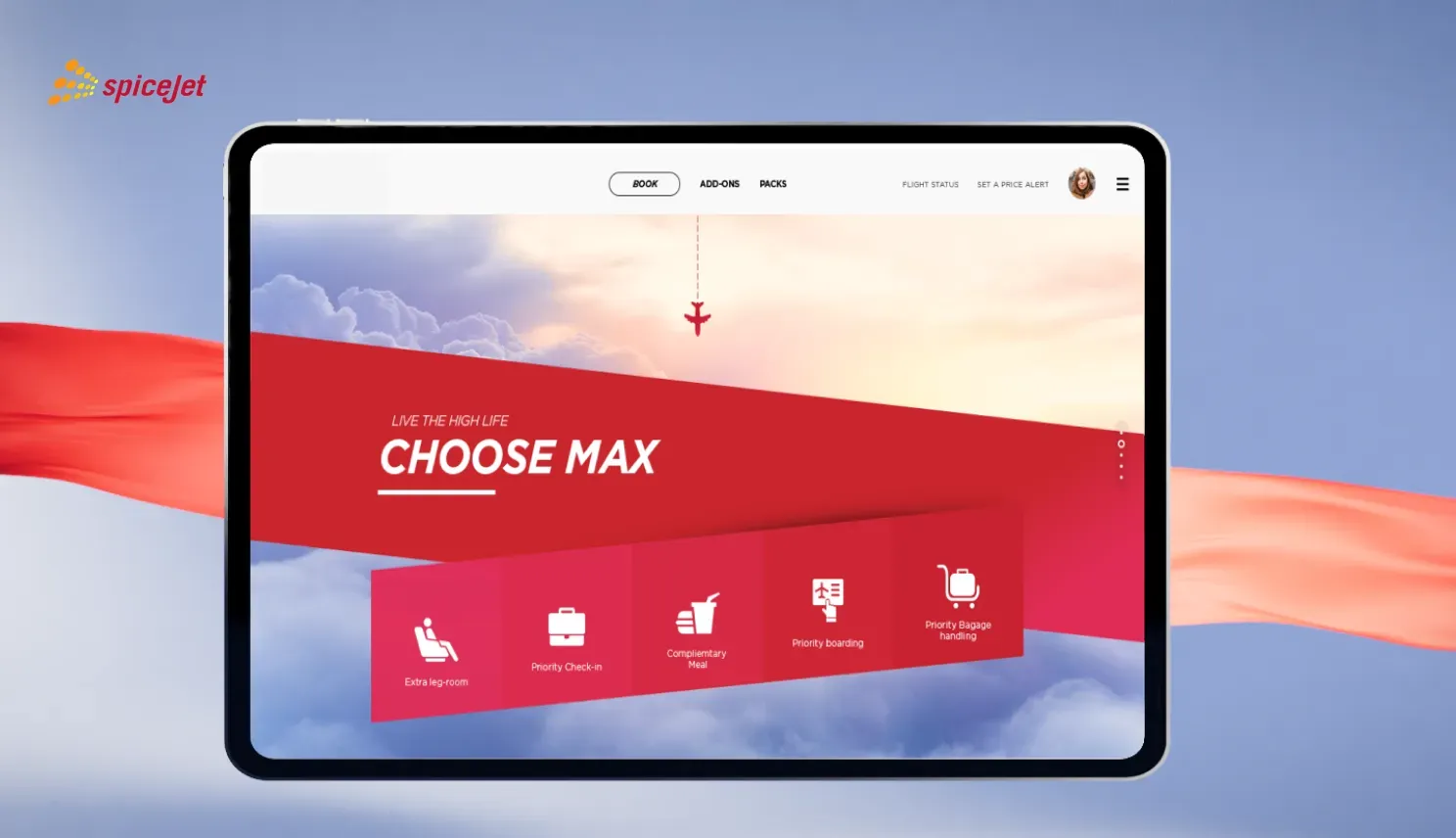
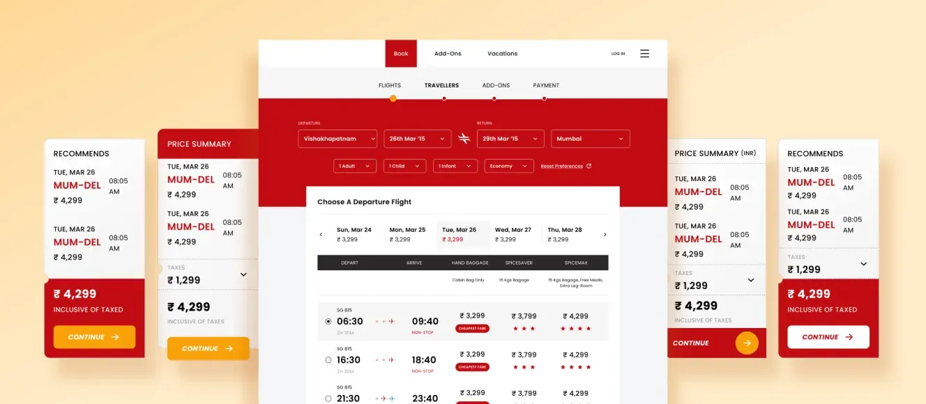
Made the booking journey intuitive by redesigning navigation, reducing clicks.

Simplified booking process
Streamlined booking by consolidating details and reducing input fields for faster processing.

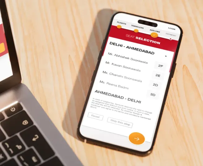
Enhanced mobile usability
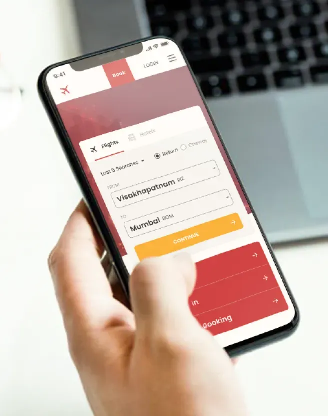
Optimized the booking journey for mobile devices, thus addressing small screen and touch interaction issues.
EXECUTION
Application and implementation of scale.
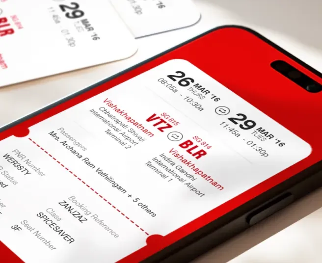
The final booking flow was tested rigorously with 100+ users against time-to-transaction and ease of navigation parameters. Over a period of one year, we changed almost 50% of the airline's website experience. We also re-designed the brand design system to create synergy, focus and engagement in the visual design. This helped elevate user focus and create scalability for a responsive web design.
INDUSTRY
PRACTICES
CONTACT US
All strong business partnerships
start with a conversation.