Building Digantara's
digital frontline
CLIENT
REGION
DELIVERABLE
TIMELINE
BRIEF
Position Digantara as a dominant leader
in a highly competed space-tech industry
The space technology sector has gained dominance, as the race for its awareness and intelligence gains momentum. The challenge was not to make the website stand out loudly, but to make it feel unquestionably reliable, especially for global government and commercial stakeholders evaluating mission-critical capabilities.
OUR ROLE

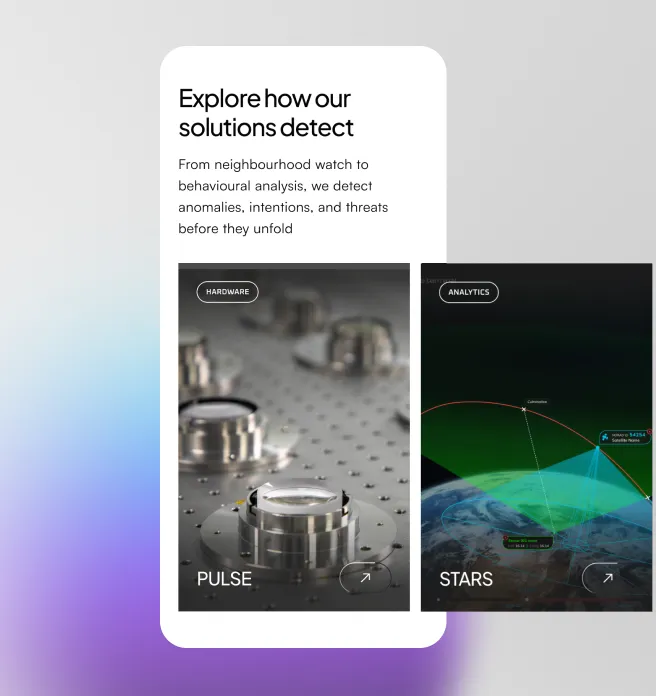
Visualise Digantara’s product stack
Showcase the full spectrum of offerings, and make it come alive. Digantara customises solutions and this was a key differentiator.

Highlight core capabilities for experts globally
Serving a wide but highly specialised audience from defence agencies to emerging space nations, the website UX required adaptation to each capability.

Signify global stature and credibility
Showcase progressive, world-first innovations and expertise on par with leading global defence tech firms, highlighting a key role in global ecosystem.
Our Approach
Keep it lean, but make it amazing. Projects come with tight timelines. We are often tasked with a deadline based outcome, however a complex sector requires adequate breakdown for the information architecture to tell the story. We met this objective with detailed planning and focus on creativity through storytelling
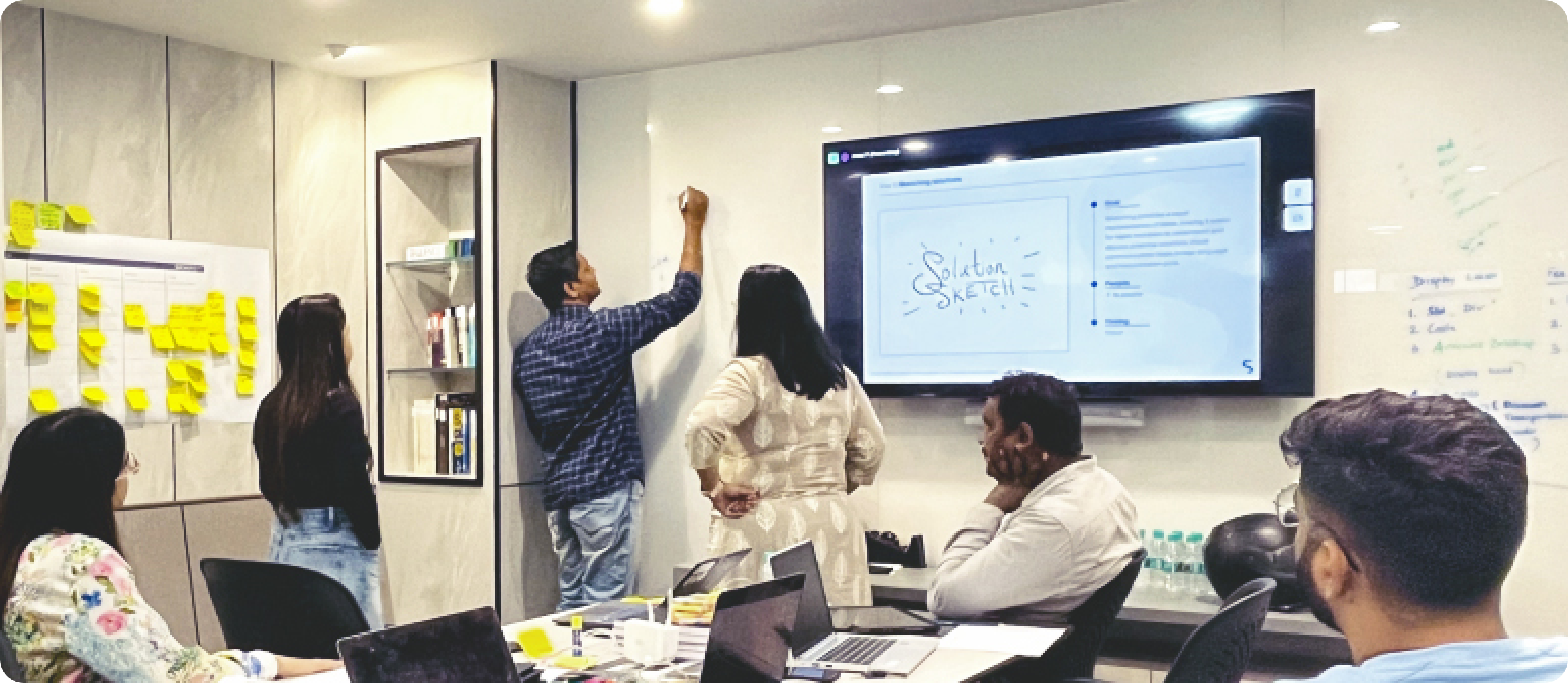
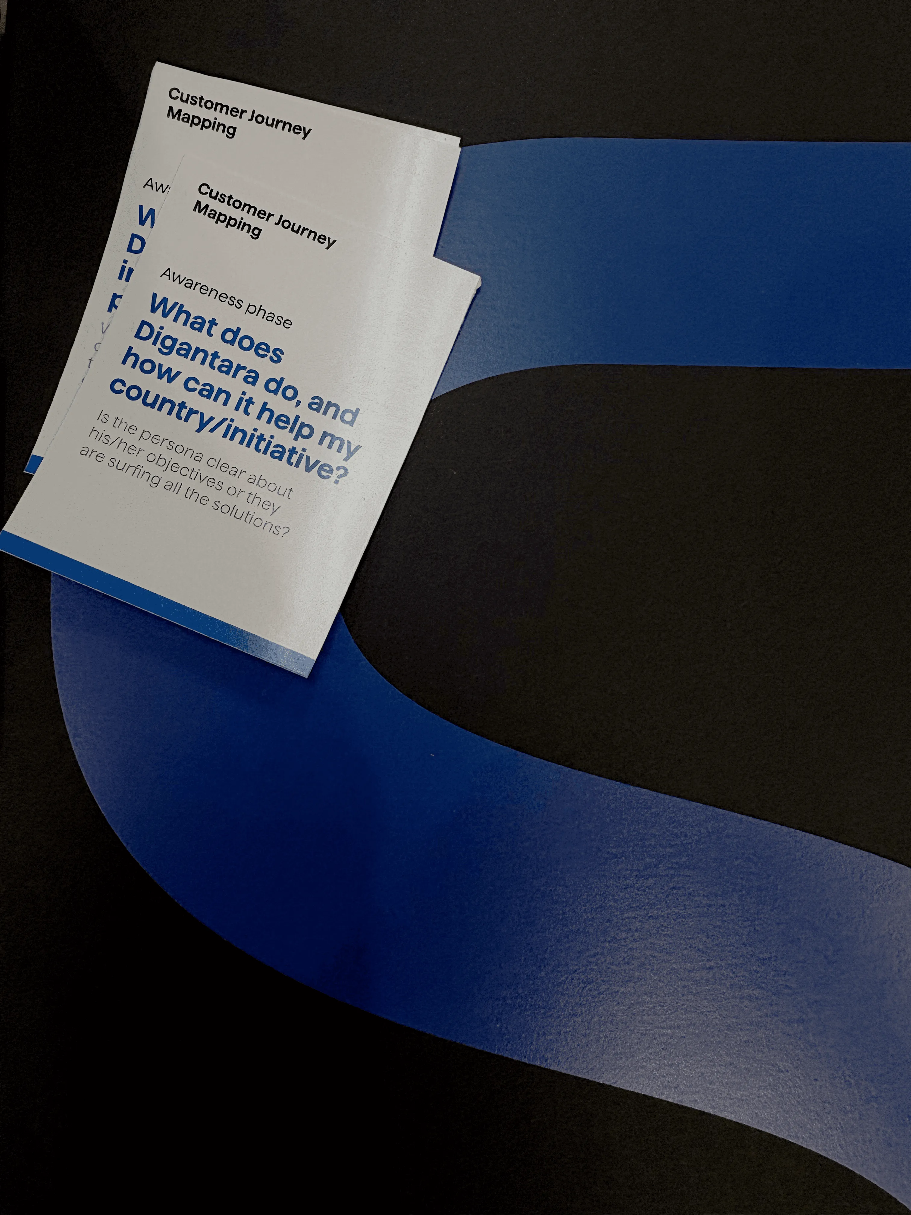
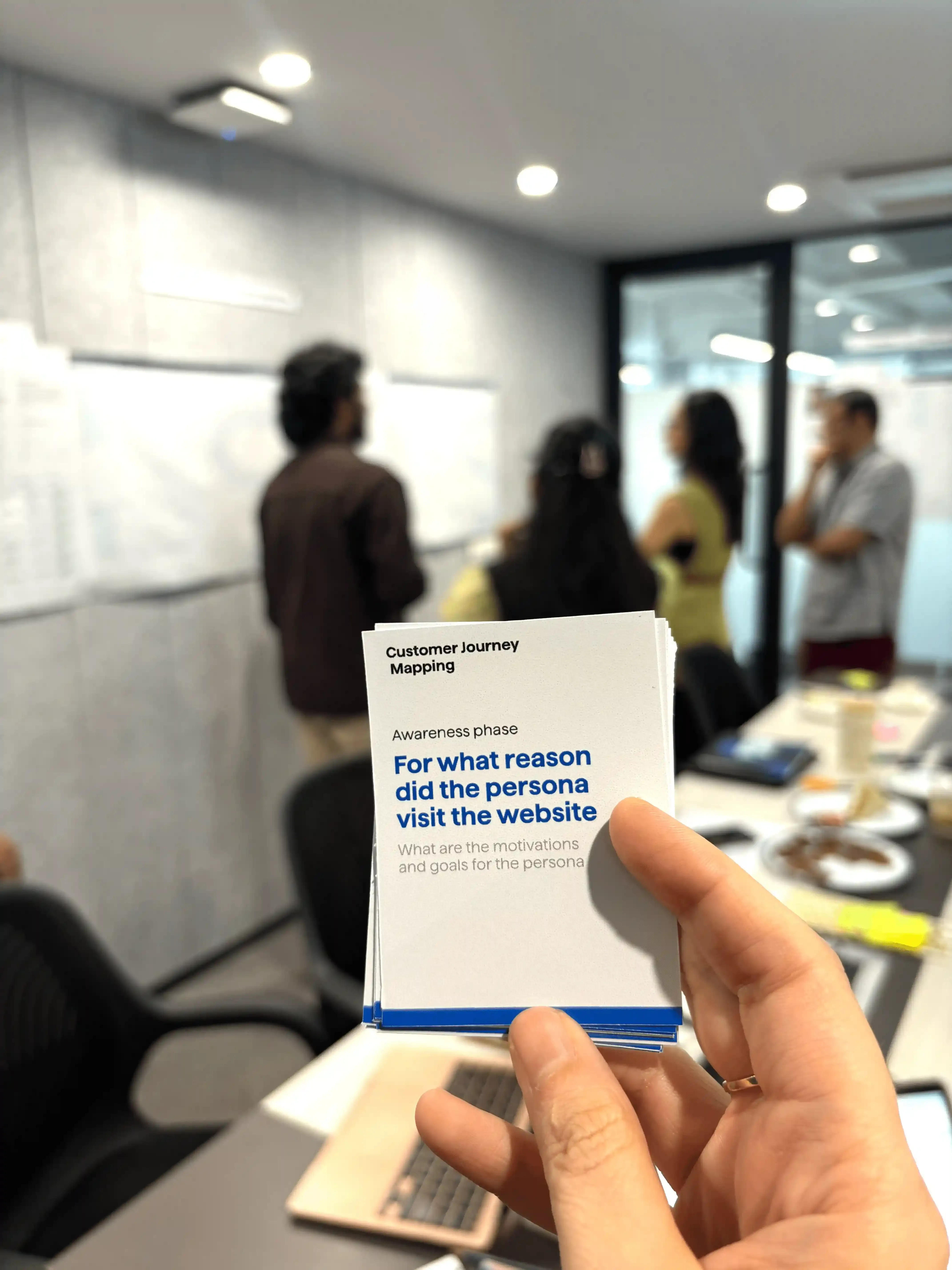
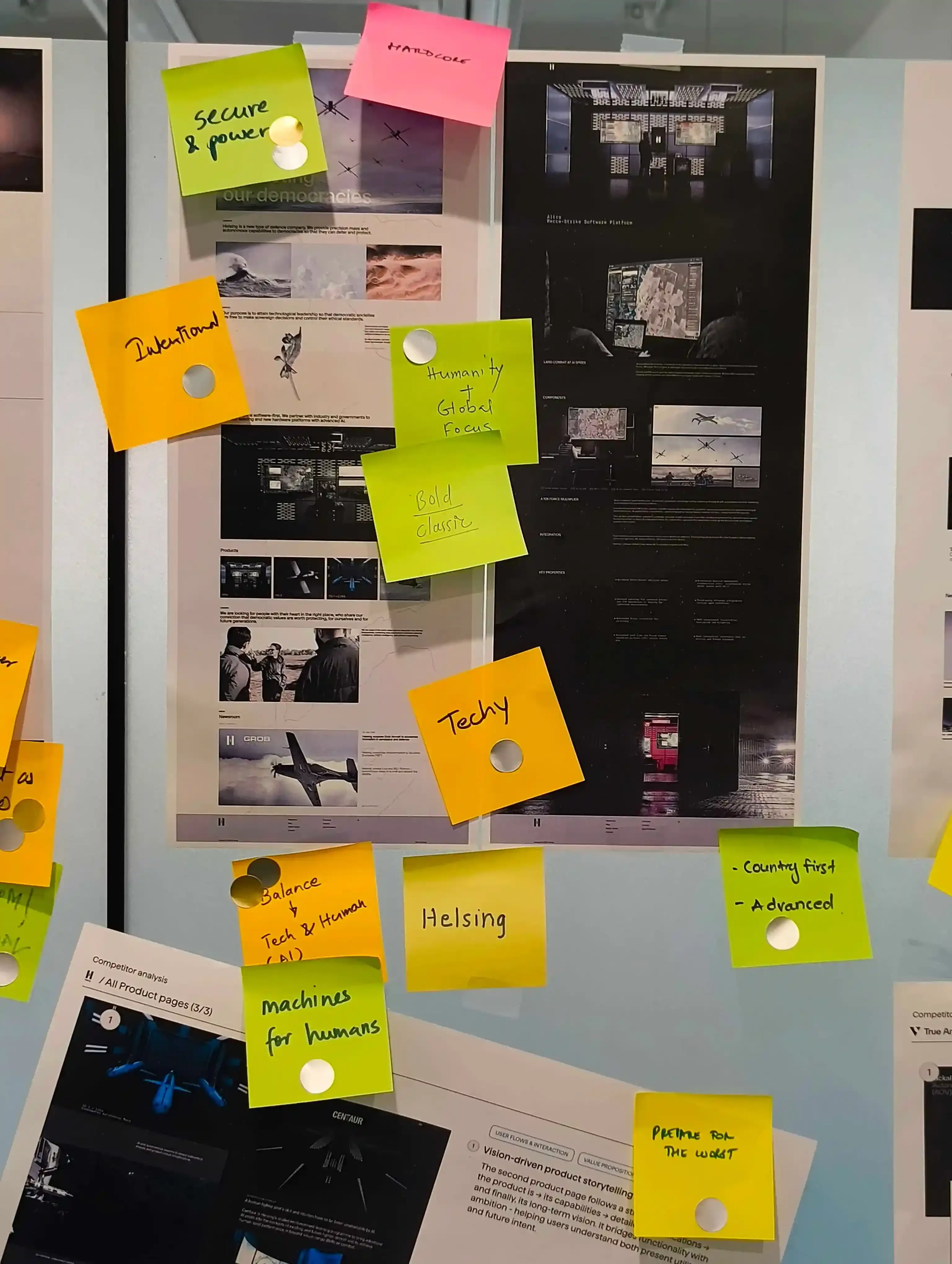
To ground the design, we ran multiple workshop modes to decipher the product capabilities and create the necessary targeted communication and writing for the website.
The word 'space' invokes a feeling - and we created multiple storyboards and art direction approaches to match this elegance for Digantara.
Engineering a responsive, fast and reliable loading experience accounting for high video, image and 3D content
RESEARCH
The language of technology,
simplified
Research revealed that Digantara’s audience evaluates credibility subconsciously. Trust was influenced less by overt claims and more by signals such as structure, rhythm, visual discipline, and how effortlessly information could be consumed. We studied how defence, intelligence, and space-tech users scan content, where they pause, and what makes them question legitimacy, and distilled the core narrative and positioning to spotlight Digantara’s technology itself as the hero. The product became the primary storytelling device, allowing us to communicate the objectives through simple information architecture that were immersive on click, yet formed a loop based user journey.
IDEATION
Containing complexity with lean UX
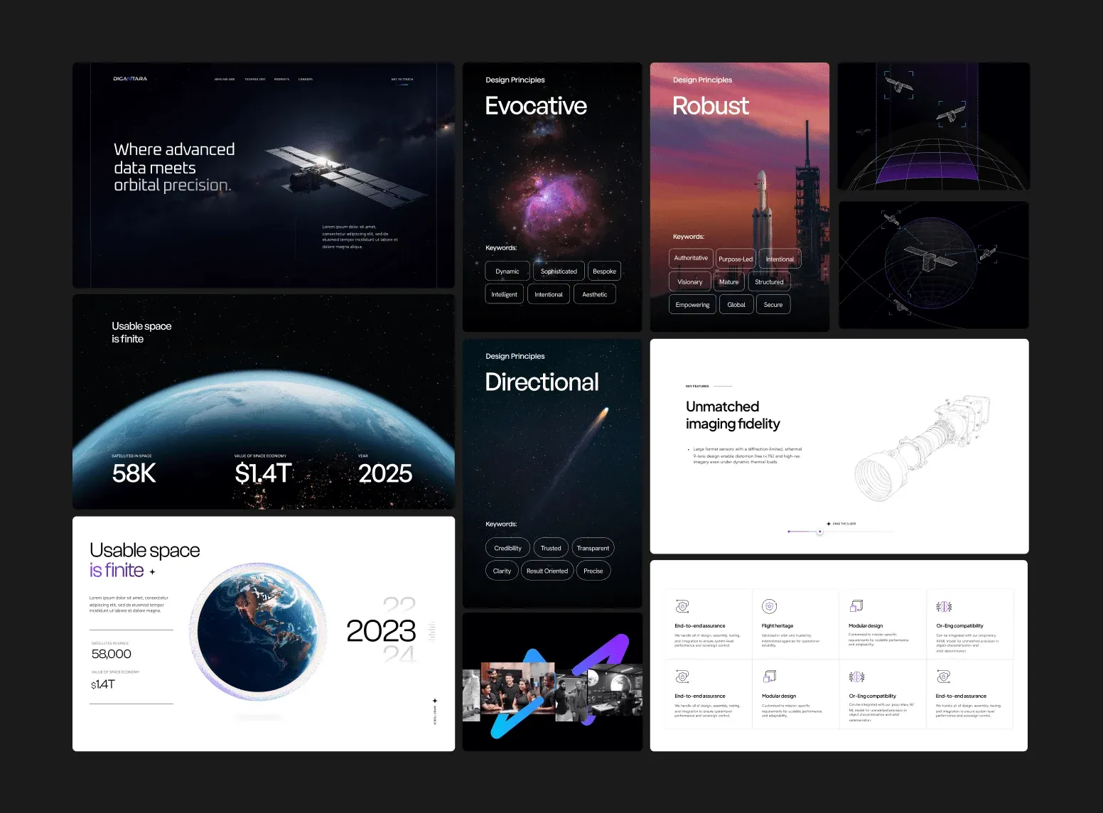
It's entirely possible for one to imagine a complex story-line for Digantara, because they have so much to convey. Instead of showcasing complexity, we explored how to contain it. To reduce the first time cognitive load, we designed the T shaped user flows, that dig deeper on each page. A new design language needs its own evolution. We visualised three mood-boards that continued to highlight the product as the main showstopper. After much temptation, we gave away the dark modes and settled for a visually elegant theme 'Purpose-led intelligence'
OUR STRATEGY

2D and 3D motion graphics
Our in-house teams built the spatial motion design through undetectable transitions, subtle parallax, and purpose-led movement for each product category

Speed and page performance
Teams worked hand-in-hand with engineers to achieve pixel-accurate execution without compromising performance, SEO and page speed.

Engineering in motion
We brought 2D and 3D motion to life through close design–engineering collaboration, to achieve pixel-accurate execution
EXECUTION
When the interface steps back,
avoiding the space-tech aesthetic trap.
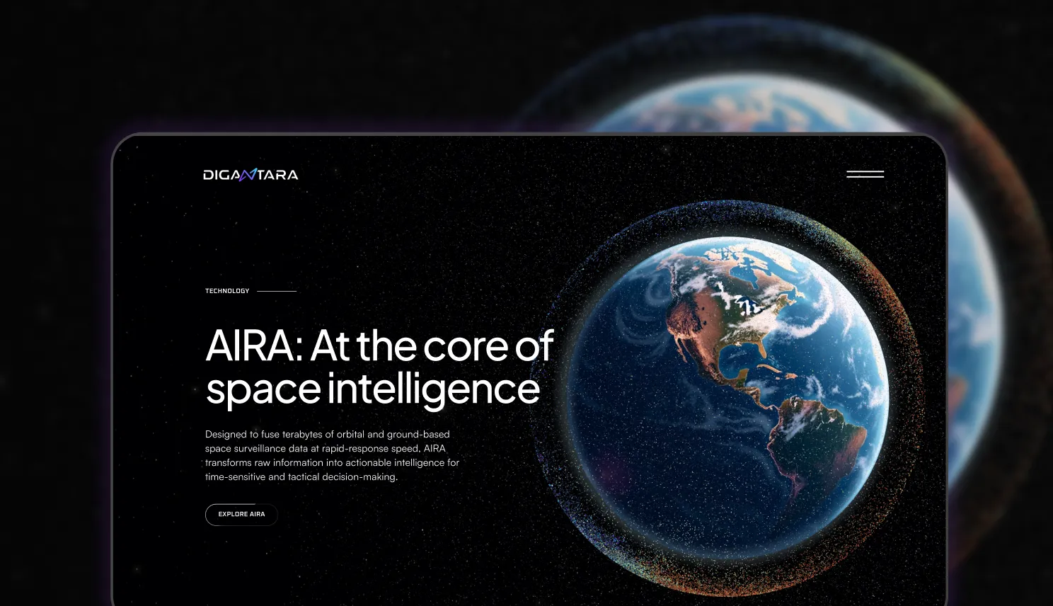
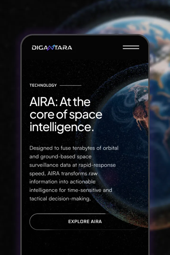
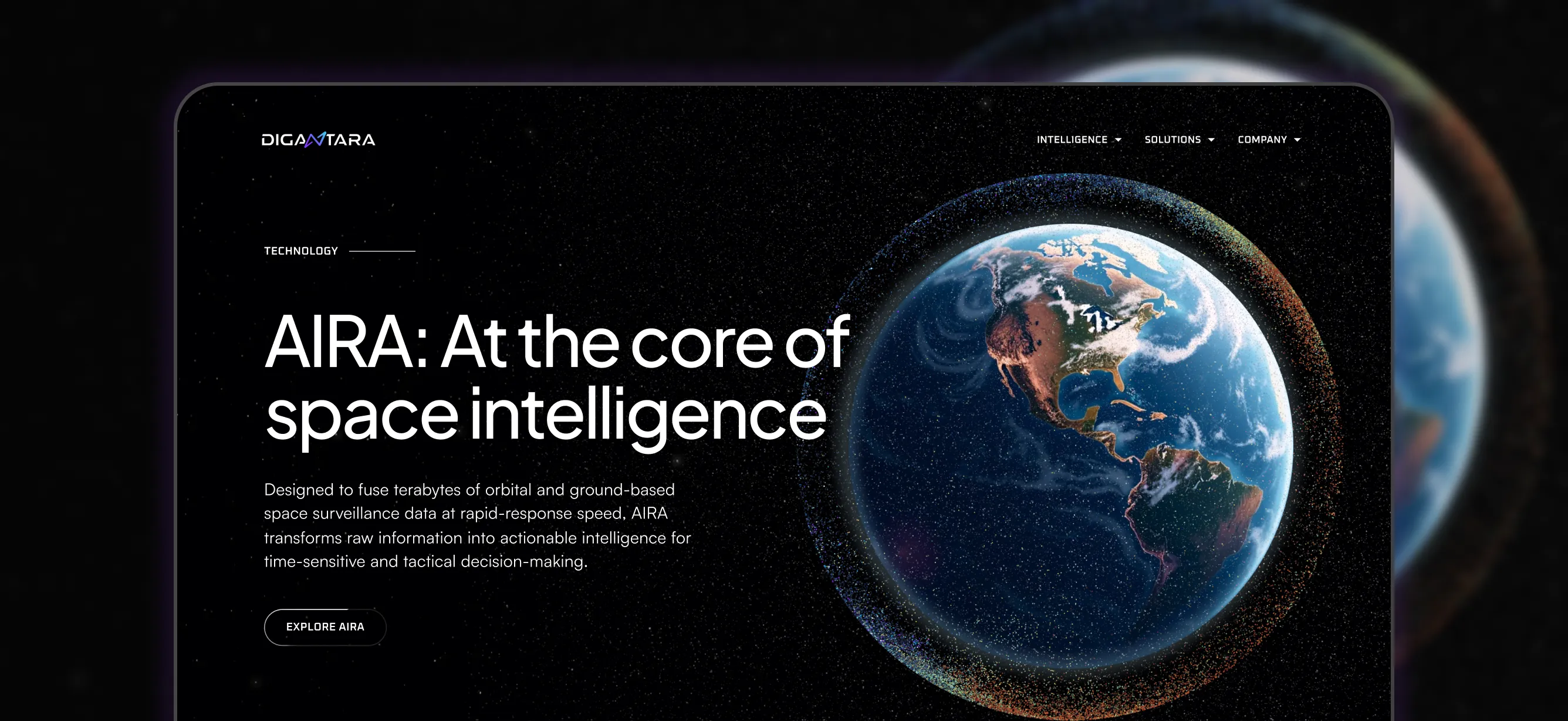
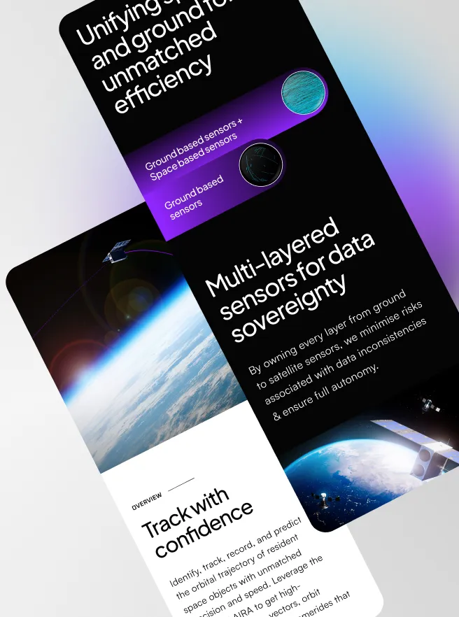
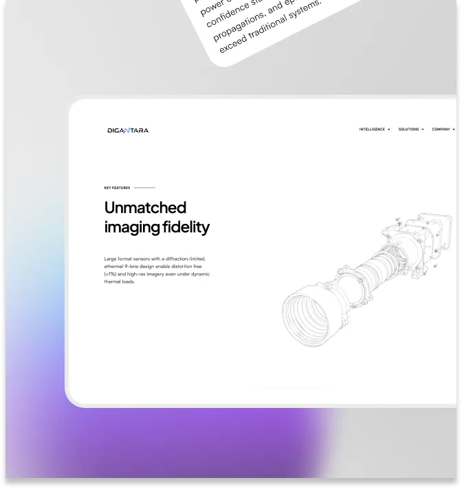
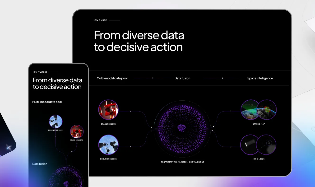
The final outcome is an interface that doesn’t ask for attention, but earns its position through clarity and quiet confidence. Users may not consciously notice the design decisions, but they feel their impact throughout the journey. User journeys were designed as inter-exploratory, immersive experiences, allowing users to move fluidly between brand, intelligence, and product, while progressively building understanding rather than overwhelming them upfront. At the foundation sat a purpose-led design system beginning with simple, precise UI atoms such as buttons, typography, and grids, and extending into richer interactions, motion, and spatial depth. Micro-interactions, transitions, and subtle 3D visuals were layered thoughtfully to reinforce meaning, guide attention, and reflect Digantara’s intelligence. Every component, interaction, and motion cue aligned to a singular theme: clarity powered by purpose-led intelligence.
More like this
CONTACT US
All strong business partnerships
start with a conversation.