A design system to match
the scale and diversity of
the world's largest democracy.
CLIENT
REGION
DELIVERABLE
TIMELINE
BRIEF
Accelerate financial
inclusivity by inspiring
young India with
accessible credit.
As a fintech platform with a user base all across India, RING's design system needs to evoke easy recognition and recall. Used primarily by modest wage earners, credibility and transparency need to reflect in the design. So, how do you design a system that is simple and yet straddles India’s diverse socio-economic fabric.
OUR ROLE

Research-backed design
Build key design principles on the plinth of an immersive research program.

User-tested execution and scale
Guide the design towards seamless scalability by user testing outcomes.

Brand-aligned experience
Create synchronicity in design outcomes for an omni-channel brand experience.
Our Approach
We engineered a customer-first design process for Ring's new design system.
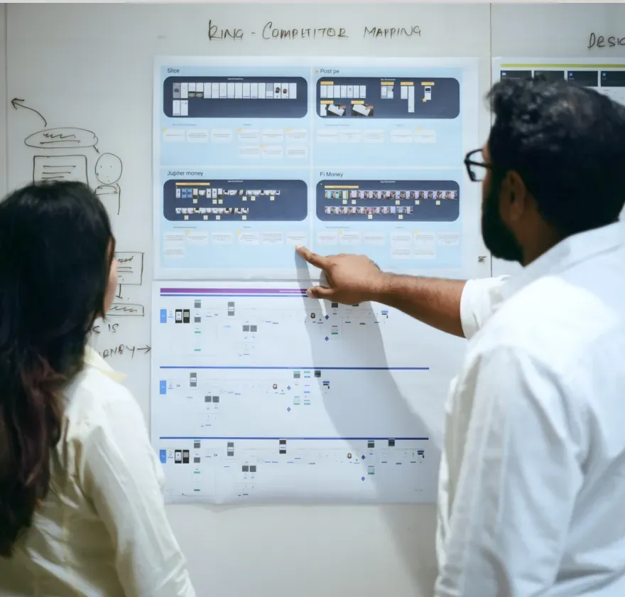
Studied persona segments, brand identity, competitor mapping and consumer engagement patterns.
Analysed gaps and affinity mapping through user research to derive key design principles.
Defined design principles and a mood board to arrive at a direction for the final visual styling.
Sampled the creation of key components and applications to UX for user testing on key user journeys.
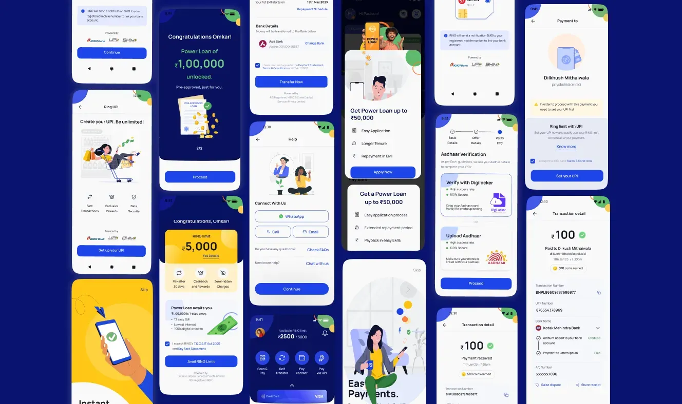
Created systematic scale up with agile development for 700+ screens across the entire product suite.
RESEARCH
Defining the design system.
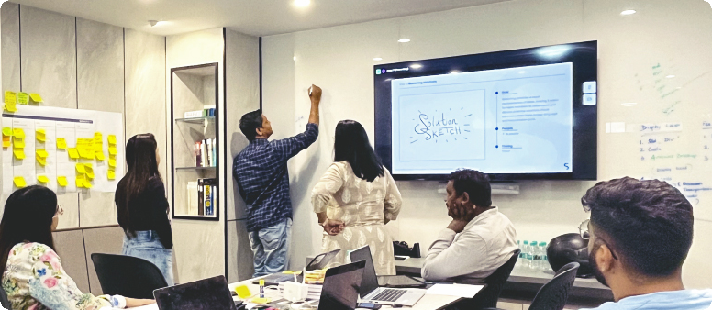
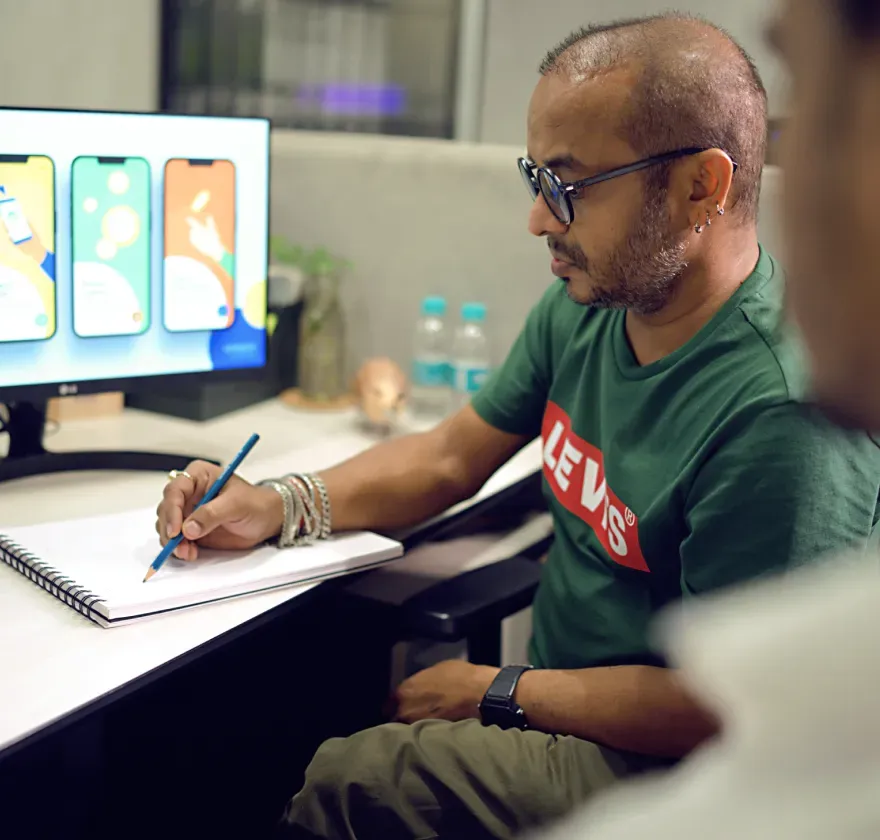
Spinach followed a disciplined design process to deduce constructive pain points for app users. Immersion phase included brand strategy, competitor analysis, user & stakeholder interviews, audit & logging of the existing system. We uncovered the need to create a design language that allowed a no-fuss interface on elements like buttons, animations and interactions.

IDEATION
Ideate and define.
Once the immersion phase and insight reporting was completed, deriving the design principles of the system became the pivotal task in order to create a precise mood board for it. Since the system called for pan-India usage we derived three key principles based on the insights we had uncovered. Credible to trust. Unified to feel. Universal to engage.
OUR STRATEGY

Insights mapping
The insights mapping phase combined user research to create core design outcomes.

Design principles creation
User research and strategy shaped the design principles guiding system creation.

Faster onboarding
Simplify onboarding, reducing app drop- out rates and add delight factors.
EXECUTION
Style guide creation, MVP user and visual experience design.
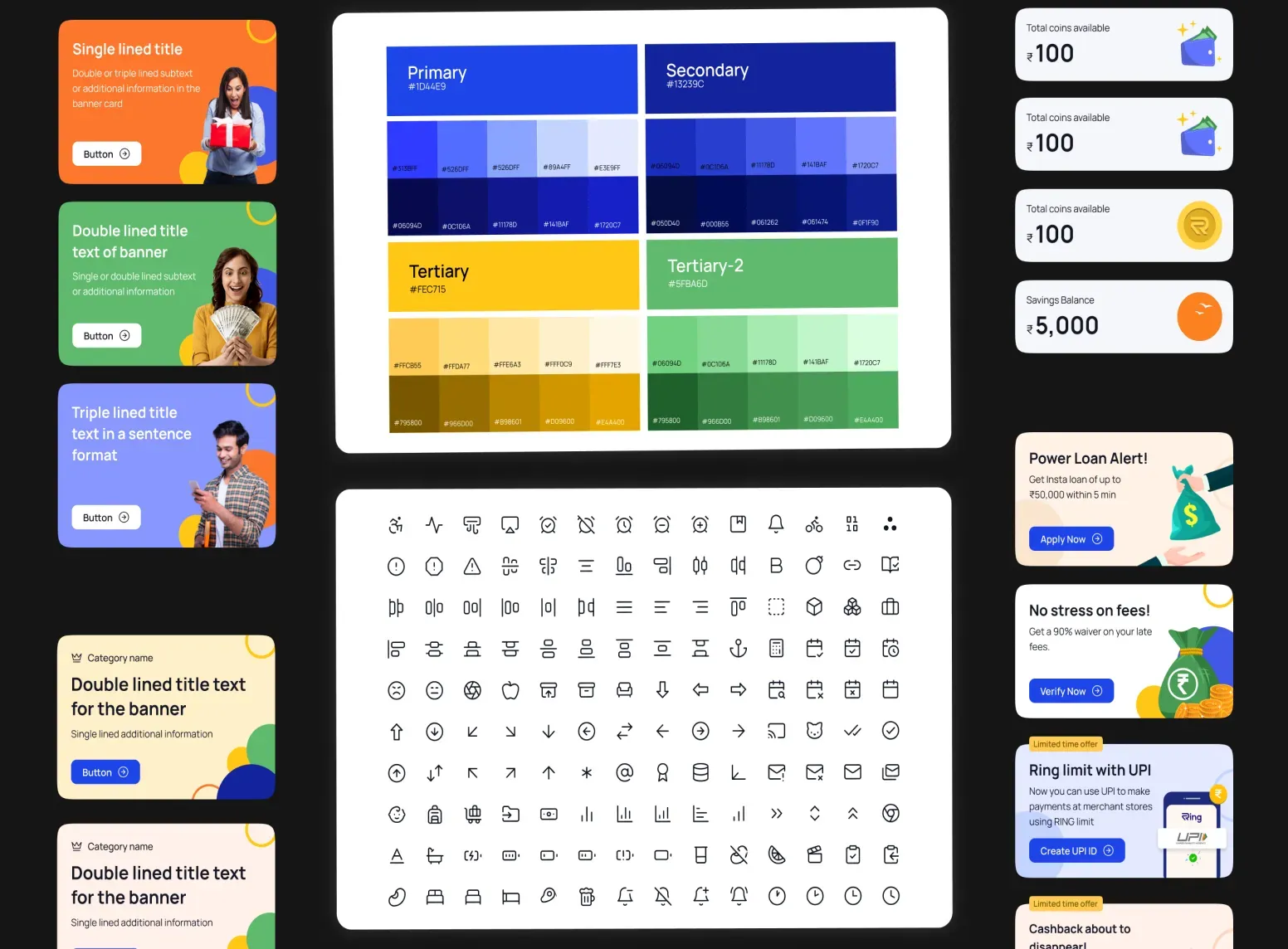
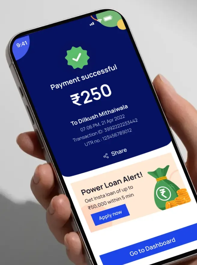
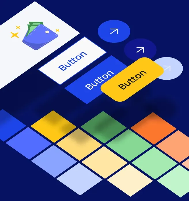
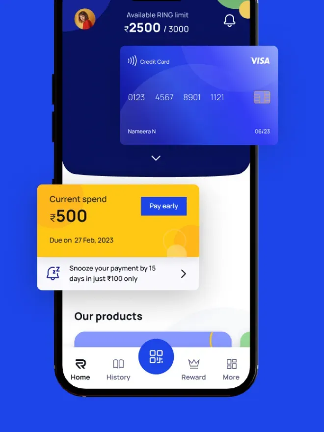
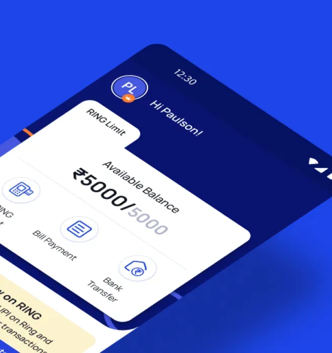
We shortlisted 3 distinct mood boards for final selection through A/B testing. The chosen route was articulated as 'Bold and Vibrant' underlining the extra boost of optimism one experiences upon receiving a shot of instant 'joy' in one’s pocket. Next, at the execution phase we experimented with illustrations highlighting the app’s complex components to define the Lite version. Ensuring that all components were synergistic with the brand values and had the potential to scale up to various templates. Finally the design system was executed with 200 components.
“Spinach helped us communicate our brand essence through every facet of our interactive design by crafting a distinctive design language that worked with a seamless user-friendly interface. They impressed with their ability to deep dive into consumer pain points and map it to a scalable design system. Moreover, Spinach's domain expertise combined with their systematic and process oriented approach resulted in a hassle-free working experience.”
Pay with Ring
Founder and CTOCONTACT US
All strong business partnerships
start with a conversation.