The Stack of Success:
Visualising Qwikcilver’s Power
CLIENT
REGION
DELIVERABLE
TIMELINE
BRIEF
Rebranding Qwikcilver -
the Future of Digital
Commerce Solutions
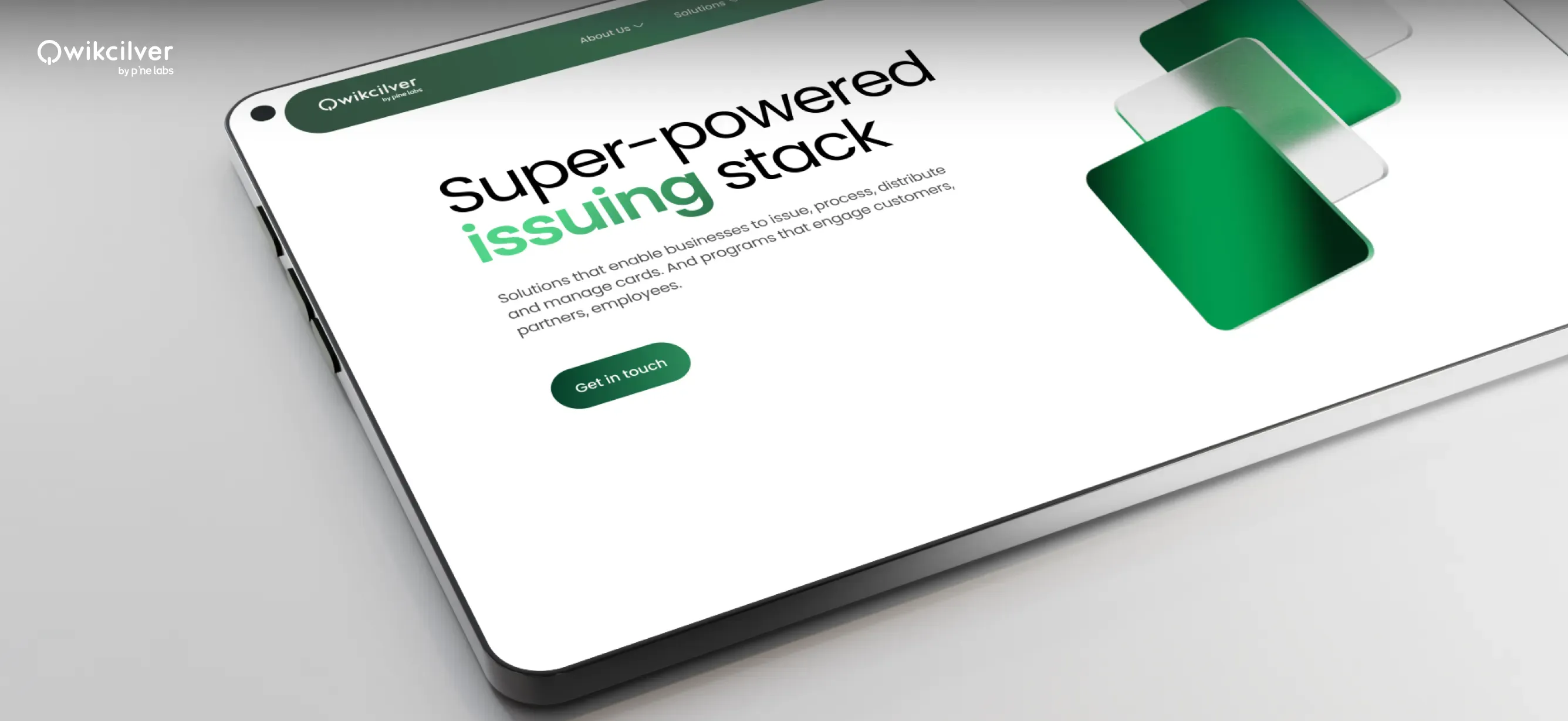
The Qwikcilver website redesign was a pivotal step in rebranding the company as a versatile, end-to-end provider of prepaid, gift card, and digital payment solutions, while also addressing challenges in presenting clear, cohesive messaging. The goal was to showcase Qwikcilver’s scalability, global presence, regulatory compliance, and connection to its parent brand, Pine Labs, which had been understated. By enhancing user experience, the redesign aimed to communicate the breadth of Qwikcilver’s capabilities, drive customer engagement, and lay the groundwork for future trust and awareness.
OUR ROLE

Insight-Driven Design Approach
We gathered key stakeholder insights which shaped the design choices, structuring the website’s flow.

Focused Communication Strategy
Continuous iterations refined UX and UI, ensuring the clear communication of width and depth of offerings

Visual Solution Design
Showcased the brand’s offerings with clear visuals, simplifying complex information and boosting recognition.
Our Approach
A thoughtful design approach that seamlessly integrates user insights, strategy, and execution to deliver impactful designs.
Stakeholder insights identified two user journeys: Qwikcilver as an expert in prepaid solutions and a partner in loyalty growth.
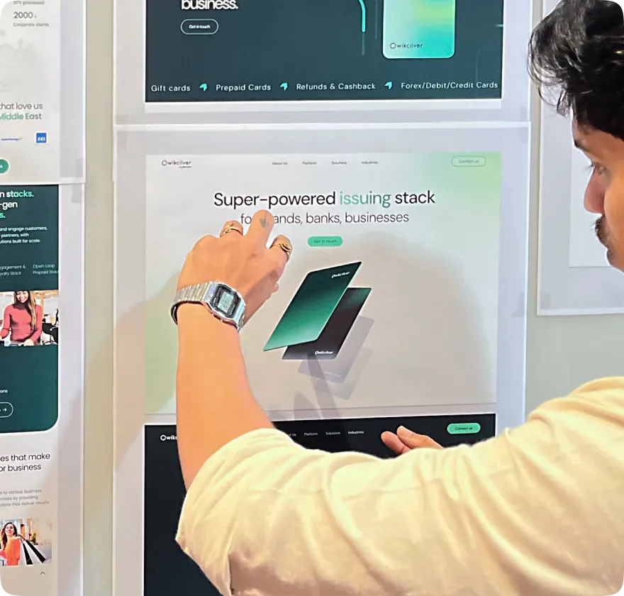
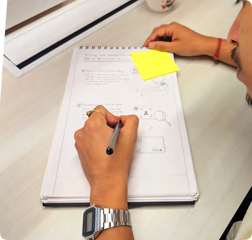
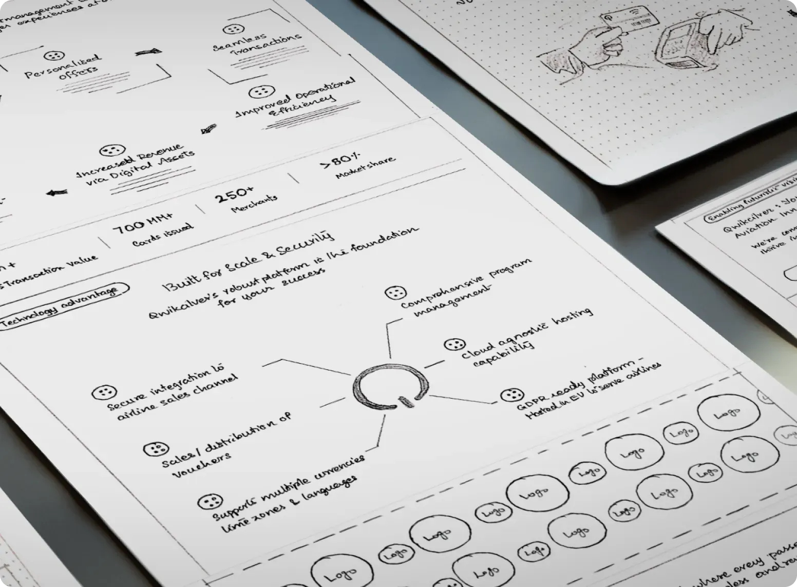
Wireframes defined the website's structure and navigation, refined through iterative feedback to improve user interactions.
Our mood board combined Pine Labs' corporate style with creative elements to reflect innovation, clarity and brand-alignment.
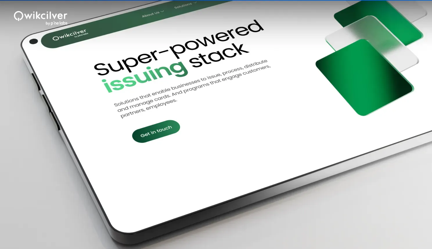
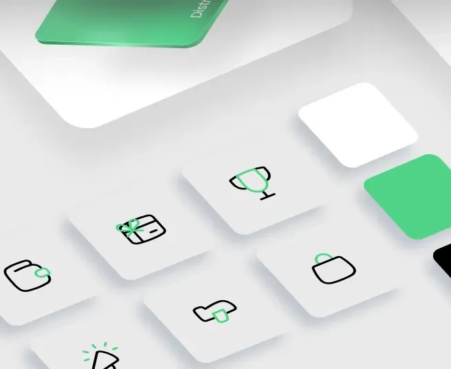
The “stack” concept created a visual metaphor for simplifying Qwikcilver’s layered solutions, for diverse industries.
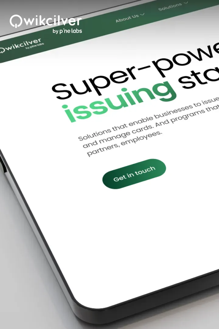
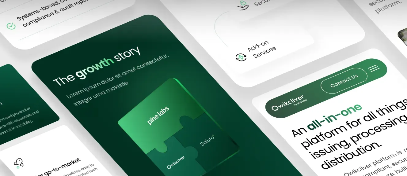
We designed a modern UI combining Qwikcilver's branding and Pine Labs' colors with 3D elements for improved engagement.
RESEARCH
Immersion and UX Research
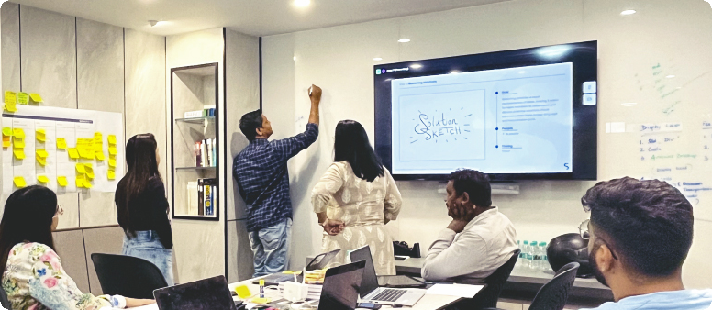
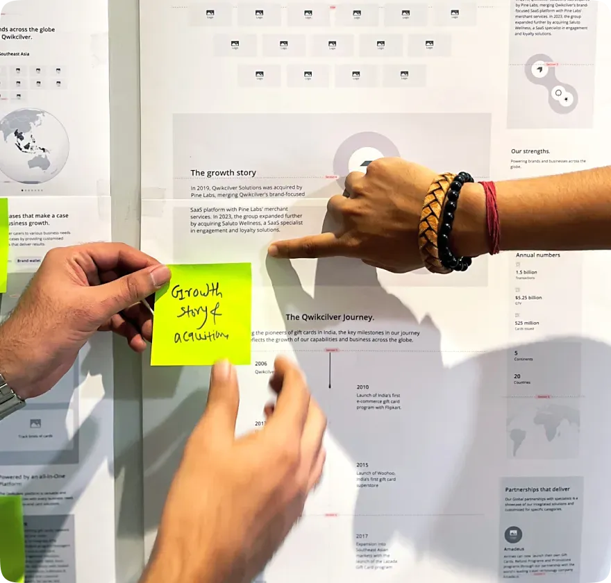
We initiated the project with an in-depth research phase, conducting extensive stakeholder interviews and mapping detailed user journeys. This collaborative approach enabled us to gain a deep insight of Qwikcilver's operational landscape, uncovering key pain points and strategic goals that guided our design direction. Interviews were held across departments—Marketing Manager (Issuing), Brand and Product Marketing, Director of Online Merchant Business, Head of Product (Issuing), Associate Director of Product Marketing and GTM, Product Management (Processing), and Head of Corporate Sales (Distribution) provided crucial insights into brand development, customer base, sector diversity, solution capabilities, scalability, and website goals and shaped experience that truly aligns with target audience.
IDEATION
Design Conceptualisation
To effectively bring Qwikcilver’s unique offerings to life, we embarked on an exploration of a diverse array of visual styles, ranging from traditional 2D layouts to innovative, dynamic 3D elements. Through this creative journey, the 3D approach emerged as the most impactful choice, infusing the design with depth and interactivity that aligns perfectly with Qwikcilver’s identity as a comprehensive, multi-layered solution provider. This approach not only enhances user engagement but also communicates the complexity and versatility of their offerings in a visually compelling manner. On the homepage, we adopted a "storytelling" approach, allowing users to navigate through Qwikcilver’s extensive range of services in a seamless and engaging manner. This narrative-driven format not only captivates users but also reinforces Qwikcilver’s position as a one-stop solution provider, ensuring that visitors can easily grasp the full spectrum of benefits available to them.
OUR STRATEGY

Redefining the Brand Stack
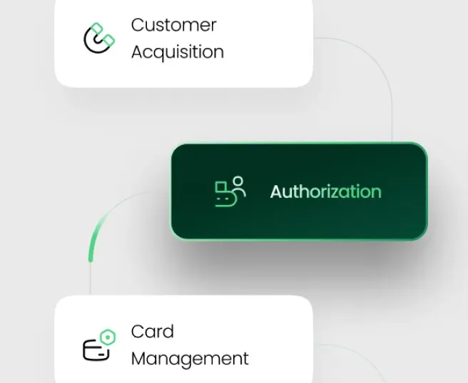
The stack metaphor visually represents Qwikcilver’s scalable solutions, simplifying how users see each service in their business model.

Connection with Parent Brand
We aligned with Pine Labs’ color palette and design, creating a cohesive brand experience that highlights Qwikcilver’s role.

Simplifying Complex Services
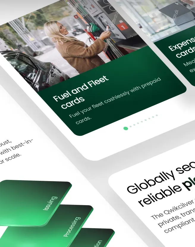
We simplified Qwikcilver’s services with industry-specific sections and interactive elements for easier user exploration.
EXECUTION
Visual Design and Brand Cohesion
Our visual design phase focused on creating a polished, engaging interface that embodies Qwikcilver’s brand identity. We incorporated Pine Labs' brand colours and cohesive themes to strengthen the connection between the two brands. Clear visuals and interactive elements were designed to intuitively guide users through Qwikcilver’s offerings, while purposeful image styles and seamless interactions enhanced user engagement, delivering both clarity and brand familiarity.

INDUSTRY
PRACTICES
CONTACT US
All strong business partnerships
start with a conversation.