Many people may not think about buying insurance every day, but it plays an important role in planning for the future. As a CX team, we knew going in that this wasn’t about big ideas or shiny UX. It was about listening intently.
"Reinventing insurance wasn't on our agenda. Understanding the ‘Great Hesitation’ was. During our week with Care Insurance, we went looking for the moments that shape a decision, the exact point where a confident ‘yes’ turns into a thoughtful ‘not today’ and figured out how to tear it down."
That’s where the workshop week began.
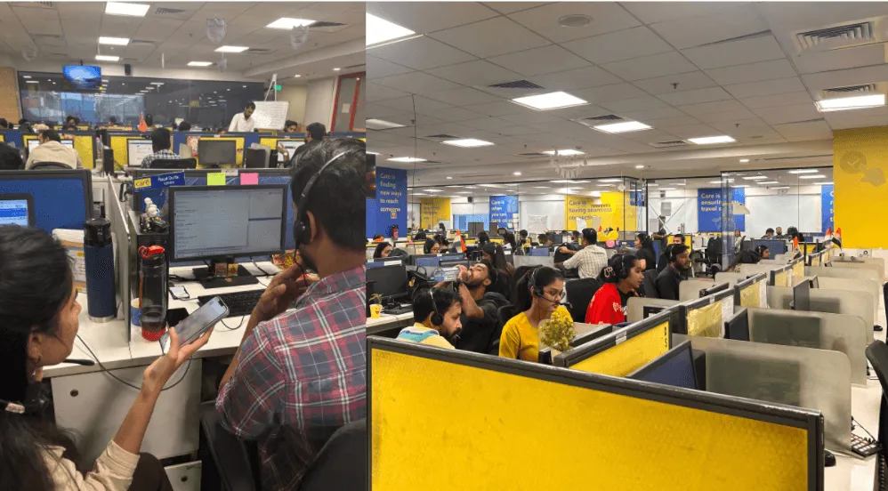
We traded conference room assumptions for real-world behaviour, tracking the journey from training rooms in Gurgaon to call centres in Noida. What we found was simple: users aren't looking for more information; they’re looking for confidence. They don't think in "coverage jargon" or product names, they think in “what-ifs". Scrolling Instagram trains us to ignore things, not absorb them. We’ve learnt almost subconsciously that when everything asks for attention, nothing deserves trust.
Insurance screens can often face the same challenge. Benefits stack up like posts in a feed: coverage numbers, trust badges, feature highlights, each competing to be noticed. But fear doesn't scroll. It pauses. And when a user is thinking about hospital bills or the claims process, more information alone doesn’t create confidence. It could lead to further ambiguity or even doubt.
Designing a digital experience isn’t something that happens solely behind a screen. The process wasn’t predefined. It emerged from situational realities, the access we had, and the questions we couldn’t ignore.
"You don’t use the same map for every terrain. We didn’t use the same UX process either."
When real users weren’t directly accessible, we followed their echoes call logs, behaviours, hesitations, and the moments where conversations broke down. When alignment was the real bottleneck, we paused interface work and put the organisation itself on trial.
The workflow evolved as the truth revealed itself. Not because we wanted to be unconventional but because the challenge demanded it.
Here is a look at our journey from the training rooms of Gurgaon to the call centres of Noida.
The CX Courtroom: Putting the old process on trial
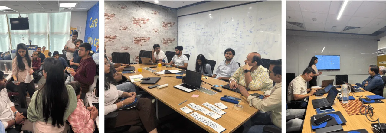
One of our biggest "aha" moments came when we staged a mock trial for our current workflow. We called it the CX Courtroom. By assigning roles like judge and jury and having "witnesses" testify using real-world pain points, the evident improvement areas in our process became impossible to ignore. It turned a dry analysis into a compelling case for change.
Balancing hard and soft data
While the CX Courtroom provided rich qualitative insights, we recognised the importance of grounding our findings in quantitative data. We meticulously analysed website analytics, user surveys, and customer support tickets to identify patterns and trends. So we combined:
- Hard data (analytics, funnel metrics) : where users are stuck
- Soft data (call recordings, casual interactions, team interviews) : why they’re stuck
Analytics identified a key opportunity, a significant bounce rate on our core landing pages. But they couldn't tell us why users were choosing not to continue. It took human-centred testing to uncover the truth: the content was a mismatch for their mental model. By layering human stories over cold analytics, we gained a complete picture of the problem, allowing us to redesign with confidence rather than guesswork.
Beyond the “Buy” button: Cracking the code of customer hesitation
We often assume that because we work in insurance, we naturally understand the customer. We don’t always. True empathy isn't a personality trait; it’s a deliberate design choice. We didn't just ask our team to "be more empathetic”, we built a system that forced them to be.
1. The Alien test: stripping away the jargon
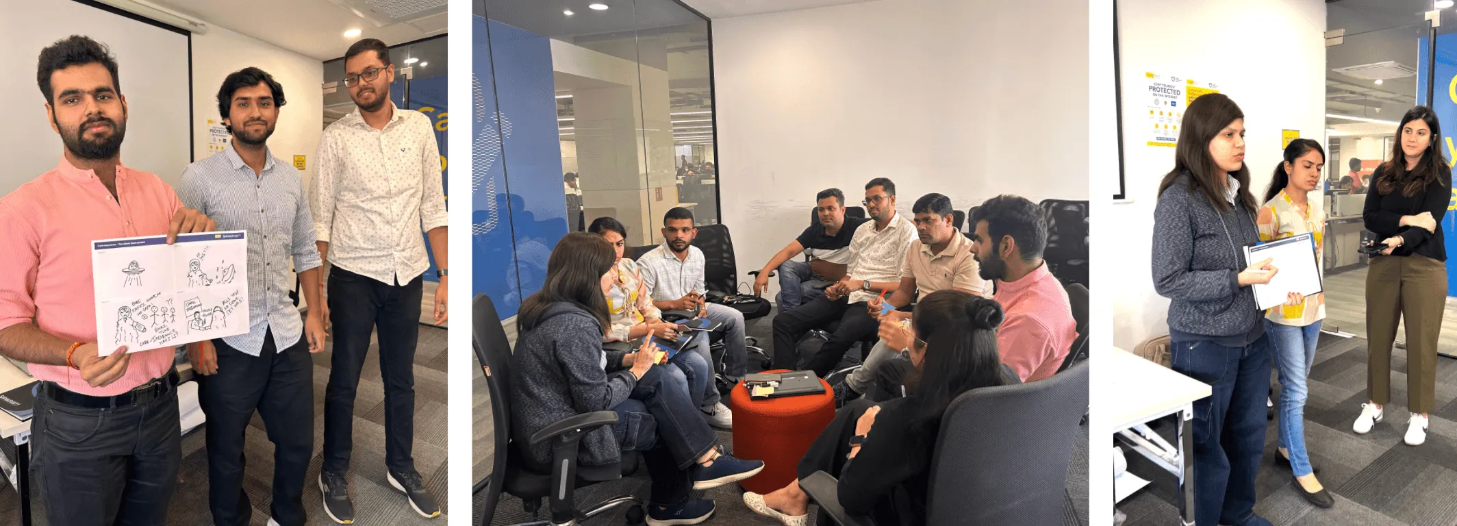
- We started with a provocation: "The Aliens Have Landed." If you had to explain health insurance to a being with no concept of human illness or currency, what would you say? At first, the room defaulted to "USPs," "riders," and "top-ups." But as they struggled to explain why an alien should care, the realisation hit: we were speaking a language only we understood.
- This playful exercise exposed a serious truth: Our internal jargon had become a wall. We weren't selling a product; we were trying to define "care" for the first time, realising that real customer emotions were often getting hidden behind spreadsheets.
2. Reverse role play: From presenter to patient
- To break the "developer bubble," we used Reverse Role Play. We took the people building the product and sat them in the customer’s chair. No scripts, no safety nets, just the audience peppering them with the hard questions every 28-year-old asks: “Why do I even need this if I’m healthy?”
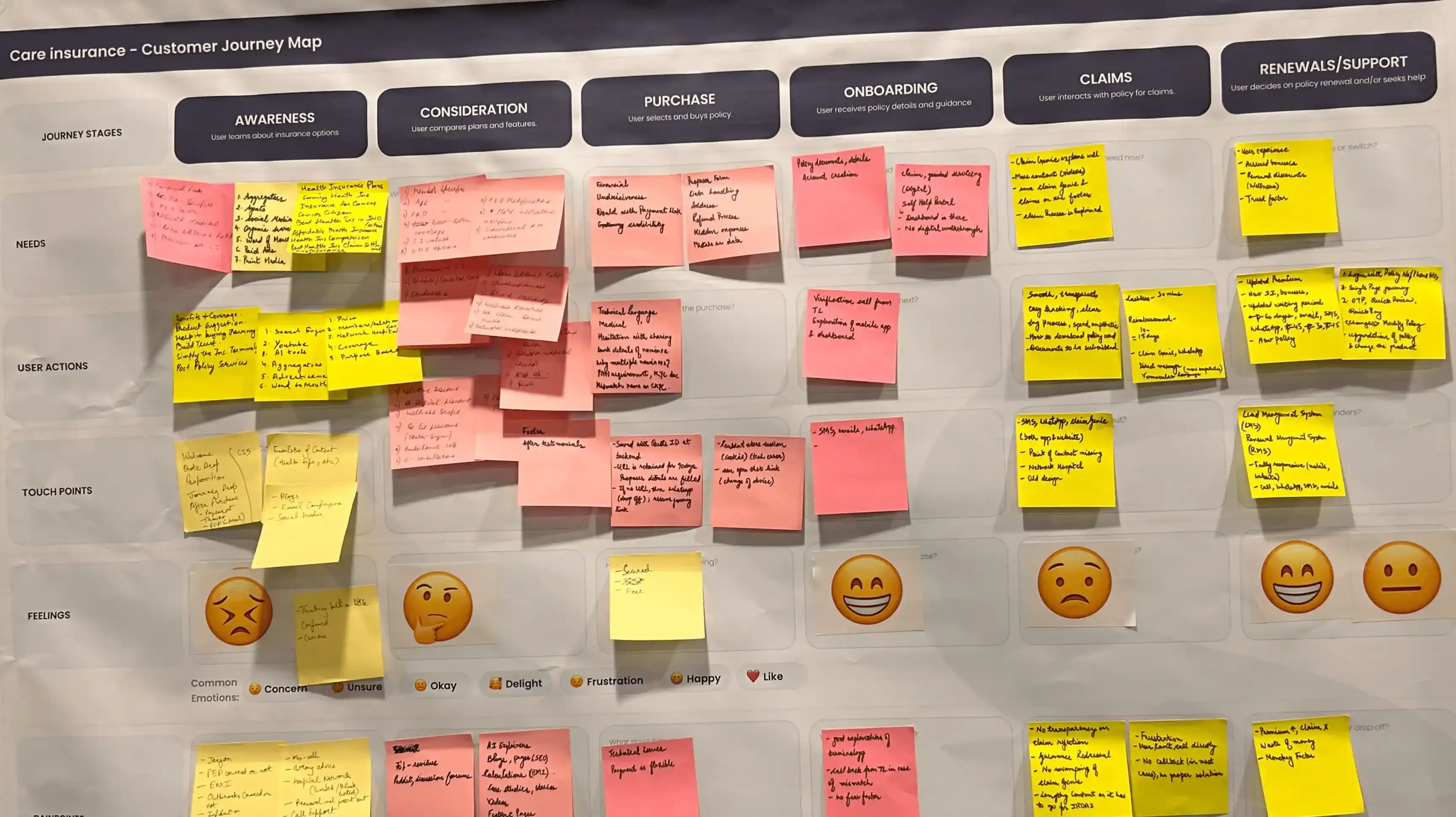
- Suddenly, the conversation shifted. It wasn't about features anymore; it was about impact. Mapping the customer journey revealed the "Panic Gap." We found that users were calling agents mainly because they were terrified of making a mistake. Terms like "co-payment" weren't just data points as they were triggers for indecision.
3. Wisdom vs. pixels: Why experience wins
- The most striking lesson of the week was the generational perspective. Their seasoned team members asked the sharpest questions. Why? Because they had lived the product. They had dealt with the real-world complexities of medical exclusions and understood the importance of clarity around a "payment pending" screen.
- They served as a vital reminder to their younger tech teams: Insurance isn’t a digital product; it’s a financial safety net. To design for a customer, you have to have felt or at least acknowledged the customer’s anxiety.
The final takeaway : Designing the "Human UI"
At the end of the week, we realised that empathy at Care Insurance isn't just about a "better UI." It’s about recognising that the call centre agent is the Human UI for the customer. If we want to fix the digital journey, we have to design it to be as persuasive, clear, and supportive as the person on the other end of the phone.
Our five-day deep dive proved four things:
- UX is human-first, or it’s nothing: If the research doesn't start with people, the design won't either.
- Data finds the opportunity; stories explain it: Analytics tell you where users drop off; role-play and real voices tell you why.
- Empathy is a designed condition: It doesn’t just emerge; you have to build the courtroom, the alien tests, and the scenarios to make it happen.
- Drama drives design: When teams see customers as people rather than data points, UX stops being abstract. It becomes tangible, actionable, and urgent.
This is the kind of research designers should crave, the kind that turns dry data into human conversations, and that drama into a product that actually cares.