
With the landscape of technology evolving at this pace, enterprise tools that support large organisations and systems also need to evolve.
In product discussions, stakeholders often bring strong sometimes conflicting views on which features matter most and what’s truly important for end users. This is where design thinking becomes essential, not as a set of tools, but as a shared process of empathy and evolution. The approach shifts conversations from “what should we build?” to “what does the user truly need, and why?” reducing friction and leading to solutions that everyone can align on.
The Pine Labs set out to revamp the Qfix platform and as their UI UX design partners, we brought design thinking and role playing as key tools to bring about this design transformation.
We studied how admins across private, semi-urban, and government organisations use tools like ERPs, LMSs, WhatsApp, and compliance portals. Interviews revealed clear patterns reliance on excel exports, heavy WhatsApp usage, and limited dashboard engagement pointing to a need for trust, simplicity, and context-aware nudges. Mapping these behaviours guided inclusive, user-centred design decisions aligned with admins’ needs.
It began with a simple question:
What if merchants could manage everything on their own, no calls, no tickets, no waiting on the ops team?
That idea became the spark for a complete transformation. The product’s core was functional, but rigid; built on fundamentals that hadn’t kept pace with user needs. Our challenge was to turn it into a powerful DIY engine: intuitive, self-driven, and scalable. Reimagining fee management for educational institutions and e-commerce for entrepreneurs wasn’t just a design task, it was a puzzle, a playground, and sometimes a maze. But the deeper we went, the more potential we uncovered. Here’s a look at the UX patterns, decisions, and turning points that shaped the journey.
Design thinking in action: aligning teams through empathy and feasibility
Understanding Business & User Needs
We started by listening closely - 6 internal stakeholders, 4 diverse users and we unearthed the friction points slowing the product down. The story was clear: despite onboarding 1100 merchants, 1000 dropped off within a year.. Limited partnerships, fast-shifting regulations, and market uncertainty meant the product was operating in a fragile, high-risk space. On top of that, design gaps were amplifying confusion: school-focused aesthetics didn’t translate well to colleges, while clunky templates frustrated merchants and jargon-heavy onboarding created barriers instead of bridges. These insights set the stage for our redesign: one driven by clarity, adaptability, and trust.
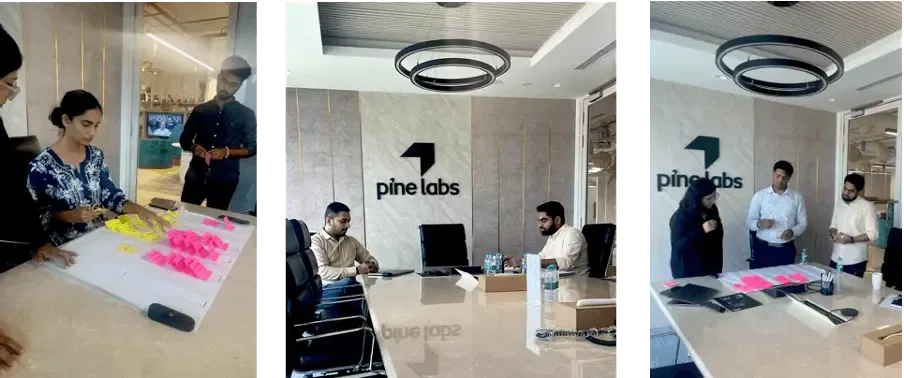
Research Workshop and Collaboration
Redesign isn’t about pixels; it’s about aligning to user needs while empowering technology. In a collaborative research workshop, we brought together voices from across the client’s ecosystem: Product, Sales & Operations, Engineering, Design, and Business teams.
With every voice came a different lens, informed by operational hurdles, user needs, and business ambitions. Through open dialogue, we recognized that innovation without alignment could only take us so far. Out of this collaborative process emerged a shared vision: a product experience designed to empower merchants, equally capable of offering assisted guidance and self-driven control, all underpinned by robust support systems and intelligent tools. This north star defined the path of our redesign.

Empathy mapping
Every organisation wants to believe that they know their customers inside and out. However, as much as you may believe that, that's typically not the case.
Everything you do is for your customers, so, naturally, you know exactly what they think, feel, want, and need. This is where an empathy map is beneficial.
Empathy mapping gave us a structured way to explore users’ thoughts, feelings, needs, and behaviours. It helped the team uncover challenges, spot patterns, humanise users, improve collaboration, and spark innovative solutions.
The exercise distilled user behaviours into four lenses -Thinks, Feels, Says, Does -with the following results:
THINKS - Best Product in the market
SAYS - I have the best operations team support
FEELS - happy with simplified interface
DOES - DIY fee creation

SWOT analysis, Card sorting, Dot voting and 5W1H method
Once the teams were aligned, we shifted focus to strategy, beginning with a SWOT analysis. This helped us assess strengths like payment reconciliation and a DIY interface, weaknesses such as unclear feature understanding, opportunities in fee-structure customisation, and threats from backend limitations.
Next, we moved into hands-on discovery. We ran a card sorting exercise to organise and prioritise insights across teams, followed by dot voting: a quick, democratic way to surface the group’s preferences and priorities. These helped reveal patterns in how features were valued and understood.
To go deeper, we used the 5W1H method asking what, who, when, where, why, and how to map real-world scenarios. Combined with Jobs-to-Be-Done thinking, this helped us unpack user expectations and business needs in context. The process spotlighted four critical features, including late fee creation and student data upload, laying the groundwork for focused, impact-driven design.
Sitemap
With priorities and features clear, we moved into structuring the experience. The sitemap served as a blueprint showing how information should flow, how users navigate, and how complexity could be simplified. It gave us a holistic view of the product, ensuring logical grouping, easy discovery, and smooth task completion.
Sketching solutions, Wire framing and UI
With a clear structure in place, we jumped into sketching. These weren’t polished wireframes just fast, rough ideas on paper. The goal was speed: to spark collaboration, gather instant feedback, and test directions without heavy investment. Everyone had a chance to contribute and shape the vision. From fee creation flows to dashboard layouts and data uploads, we explored multiple possibilities and iterated quickly before moving to higher-fidelity designs.
